

Above: My original concept mock-up of the raised platform bed space, with ample storage sections underneath and a room divider.
Adopting an attitude of acceptance when things don't go exactly to plan can unearth nuances of design - imperfections - that tell a story in form and function.
If you can go a little further in presence by embracing those moments, however challenging, (and trust me, overcoming some problems can be fucking infuriating at times) then the cracks can give way to design choices that add a little soulfulness and character to what you’re doing.
Having something that says what it is on the tin is satisfying from the point of view that you’ve been able to materialise an idea to a fairly tight specification, sure. If you want to add a little zest though, there’s no surer way to do that than to see the imperfections that emerge during the process as celebrated highlights, or as stepping stones to a playful evolution of an initial idea.
A little bit of planning goes a long way, and in some cases is absolutely necessary, but stressing out when deviations occur might blindside you to discoveries that would otherwise evade you.
The mock-up provided a solid source of motivation and acted as a guide in terms of getting a sense of available space, understanding its necessary functions and staying true to the overall vision of the project.
When I think about transforming a space, the insight usually comes quite ferociously, in one big spatiotemporal rampage of the imagination. This imaginary frenzy is an exciting stage of the process for me, but it’s undoubtedly an intense one too because it wants to be crystalized. Usually I can’t or don’t want to sleep much until the potentiality of an idea is eked out. That usually requires a lot of parts to be working as a synchronous whole and designing everything at once. Thinking about the space as a whole can feel overwhelming, yet it allows the space to speak to itself and find a nice balance of proportions.
So while it’s not a golden rule to produce a concept drawing, it definitely helps me ground an idea and alleviate the need to keep all that information on perpetual standby in the brain.
The real fun, though, is not just in being able to look back and see the original idea come into fruition, but also to see the little cracks appear in the process that give way to design choices that would have been impossible to arrive at otherwise. To me, that is sheer magic and a joy to be a part of.
As with Jazz, freedom of expression is paramount. There’s room for that magic to arise spontaneously in the process as is wants to, but there’s also a basic underlying structure that supports the rising and falling of expression to occur.
Some of my design decisions:
- A raised platform maximises storage and creates a playful perspective of the room: I decided to play to the strengths of the building’s original features, which in the case of this ‘Alt Bau’ (old construction) building, it is high ceilings and a compact, yet spacious room. With space at a premium it would have been a missed opportunity to overlook that from a design perspective and risk a cluttered feeling. It doesn’t seem like much, but there is a LOT of storage space underneath (at least 3 m³ in just this section), and the modular construction of the individual platform units allows for separate storage sections that will house pull-out trolleys for an ergonomic touch. Variations of height make an occasion and offer different spaces to inhabit, which adds to the versatility and vitality of a small space. It keeps it dynamic, playful and interesting in other words.
- Extra space for a walkway gives a relaxed and grounded feeling from the perspective of the bed, which is raised higher still: having a massive drop off or clambering up a steep set of steps is great if your an 11 year old, but can get old fast otherwise. Playfulness is important, but so too is creating a relaxed and ergonomic space. With an ample walkway (at least 50cm wide), there’s room to perch one’s legs at the side of the bed casually and delineate the space further to create a a little cocoon. Wider space at the foot of the bed gives some ‘breathing space’ to the steps, making the space more light and open, while acting as a transitional space to the next part of the room.
- Building a cut away step into the platform saves space and acts as a central pivot point for the room: Using a shop-bought or self-made set of steps leading up to a uniformly-high platform was my initial idea (probably because integrating a step into the platform seemed a little daunting to me) but it would have severely hampered the feeling of openness in the room as it would have jutted into the line of sight of the doorway and take up the middle of that space. This solution added character and also acts as another space to sit (I love to tie up my laces there before I got out).
- A room divider delineates the space and sets clear intentions, while the shelving spaces can be filled over time, adding a sense of story and personality to the space: having a variation of height adds some diversity, with the tall part echoing the height of the door and suggesting a feeling of protection/barrier. Open sections allow for the space to feel simultaneously cosy and intimate, and open and spacious. (I can also pass things through while I’m to-and-from the kitchen so I don’t have to carry them ALL the time.
- Adding some skirting either side of the bed means I can place a cup of tea there: I know the idea of drinking a cup of tea or coffee in bed raises eyebrows for some, but I quite enjoy that from time to time, especially when I can enjoy a bright lazy morning or get cosy with a book in winter. It’s a small detail, but one that needed to be factored in from the beginning. A curved corner shelf built from a scrap of wood keeps my reading light tucked away nicely and is the perfect distance away for reaching.
ground an idea
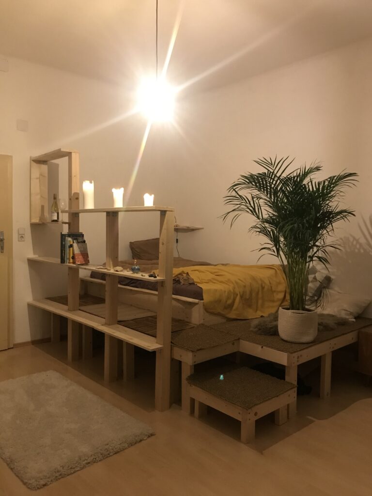
Above: Main structure of the raised platform bed and bare bones of the room divider finished. The glaring light was a source of annoyance for me both in terms of its awkward positioning and the way it glared, almost obnoxiously.
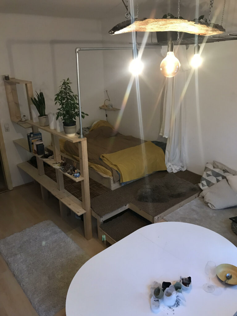
Above: Updated space, featuring a custom-built light feature that has been raised and extended to the back of the room so as to not obfuscate the space, a scaffold railing with translucent linen curtains that pull across for privacy and warmth, an extendable table, and an extended platform for a versatile seating/lounge space.
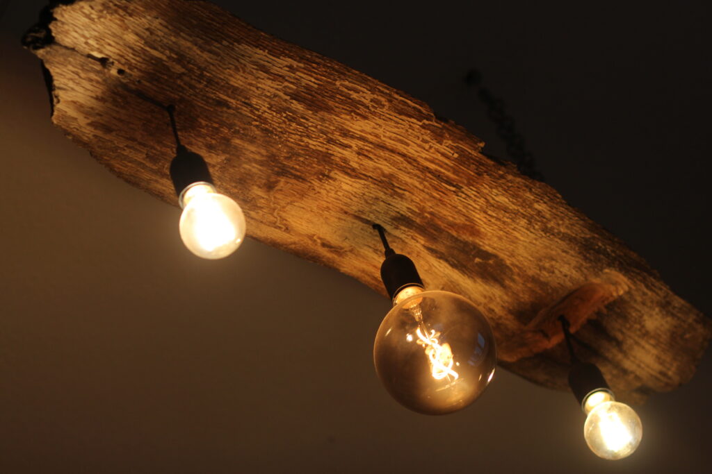
Left: Custom light feature made from a beautiful foraged piece of wood I found in Steinhof Grunde. The wood had been sitting on a shelf for years, but it was too beautiful to throw away and, well, it finally found its use.
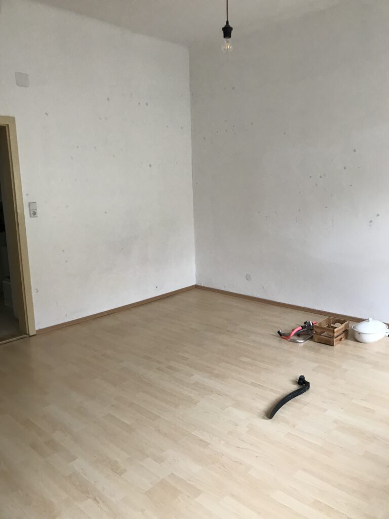
Above: Imagining and measuring the blank canvas of a space. Building a custom bed space vs buying something and plonking it there meant sleeping on the floor for a week, but it was worth it.